
Responsive Web
Updated:
Responsive Web이란 무엇인가
Responsive Web은 데스크탑, 스마트폰, 태블릿같이 다양한 기기에서 사용자가 웹사이트를 사용하기 편하고 보기 좋게 바꿔주는 기술이다. Responsive Web은 특정 프로그램이나 Javascript언어가 아닌 HTML과 CSS만으로 구현될 수 있다.
Responsive Web 예시 - 레이아웃
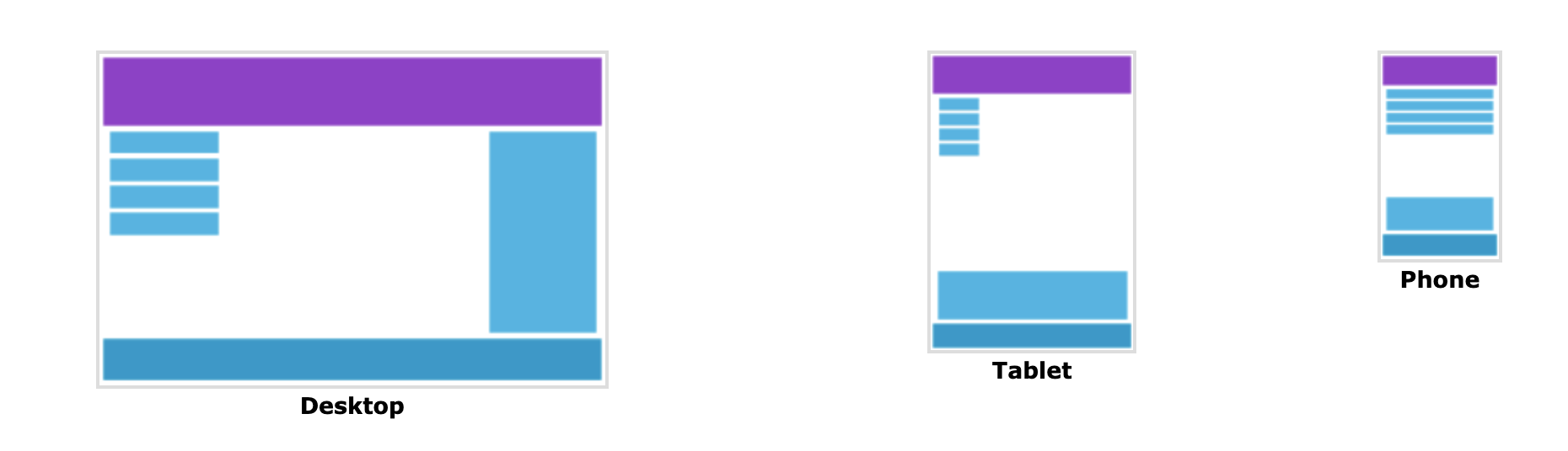
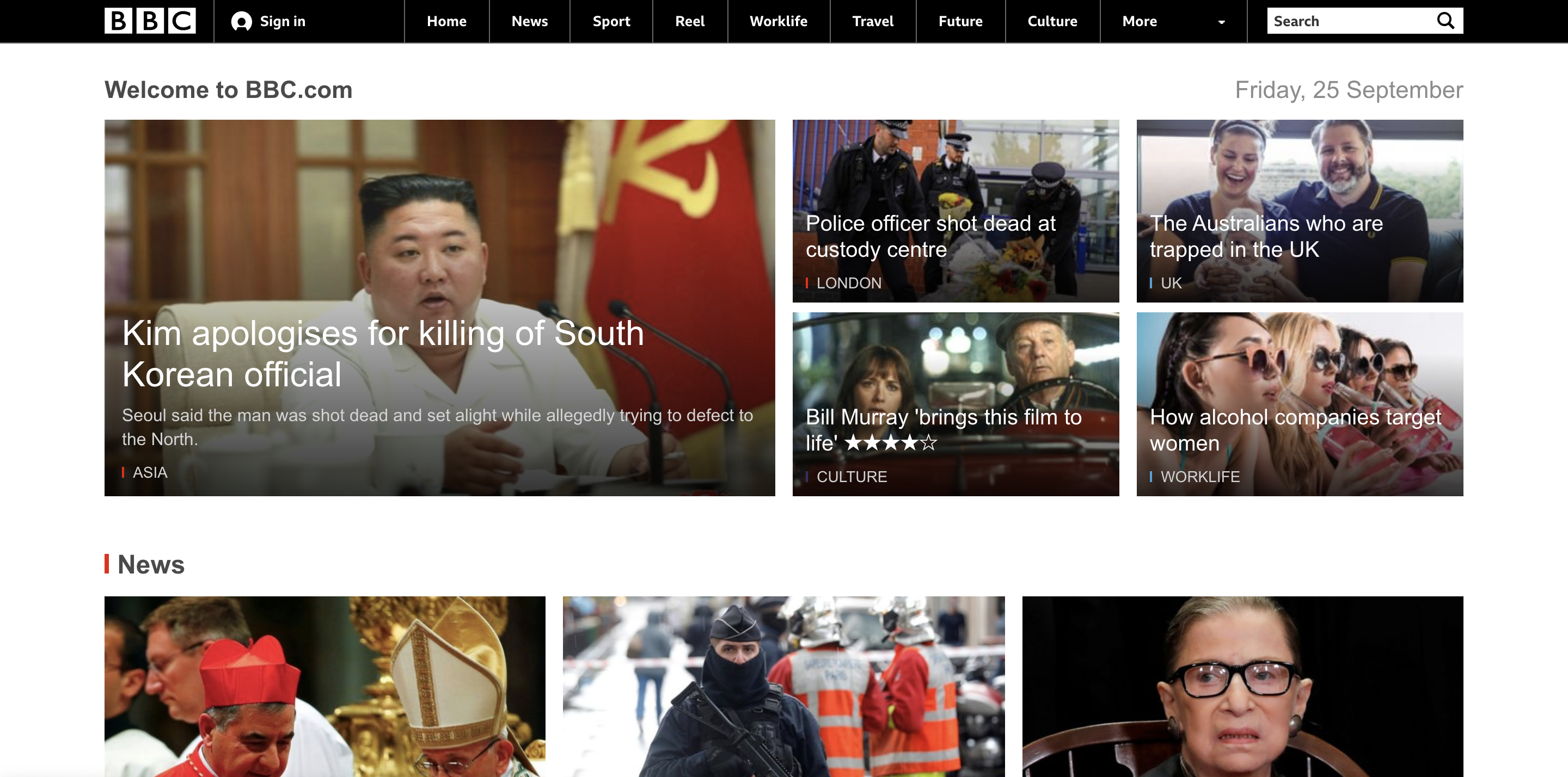
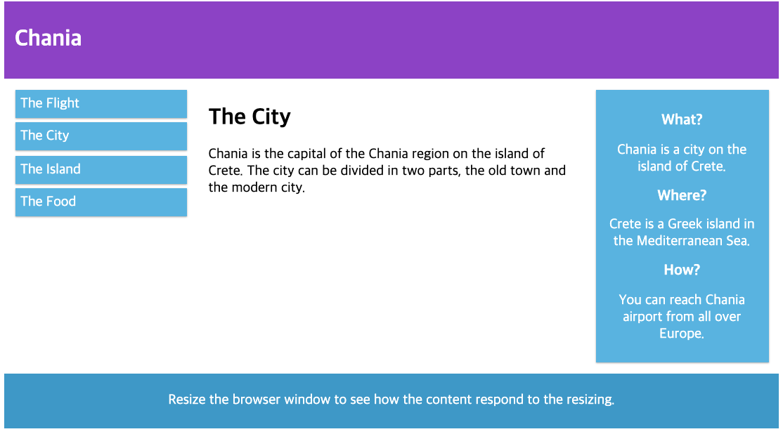
Responsive Web 예시 - 데스크탑 화면
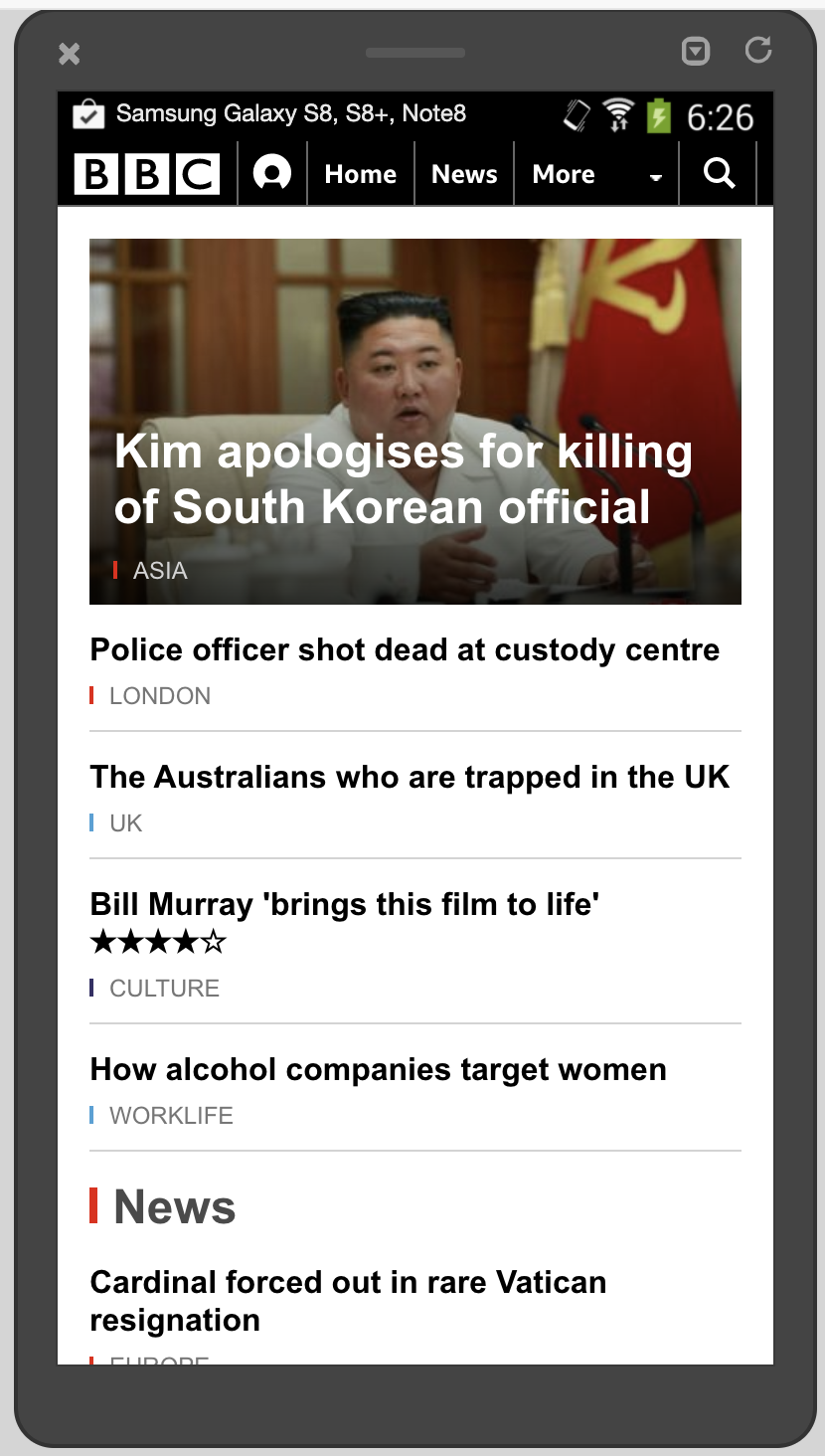
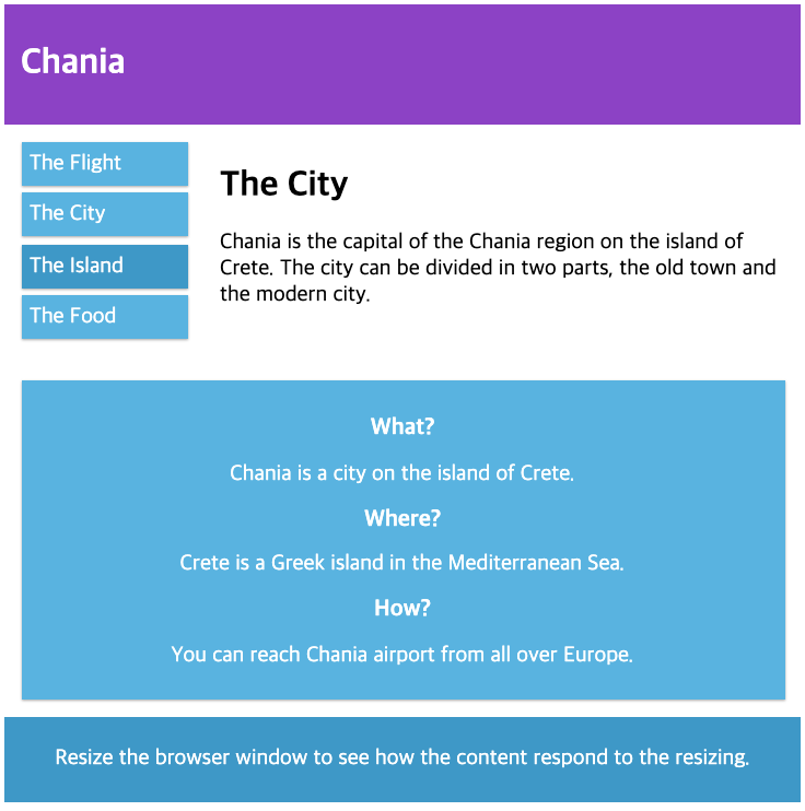
Responsive Web 예시 - 스마트폰 화면
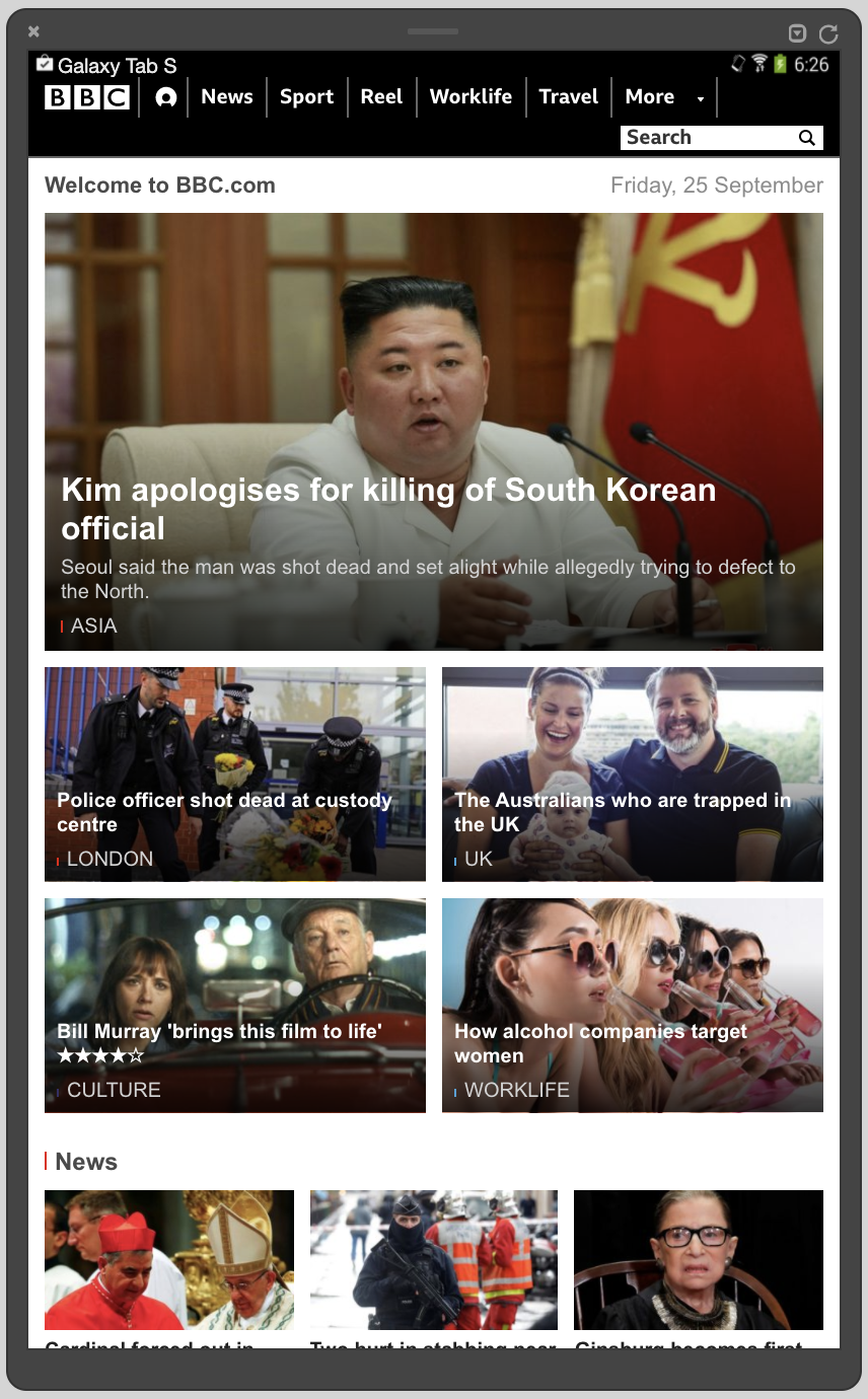
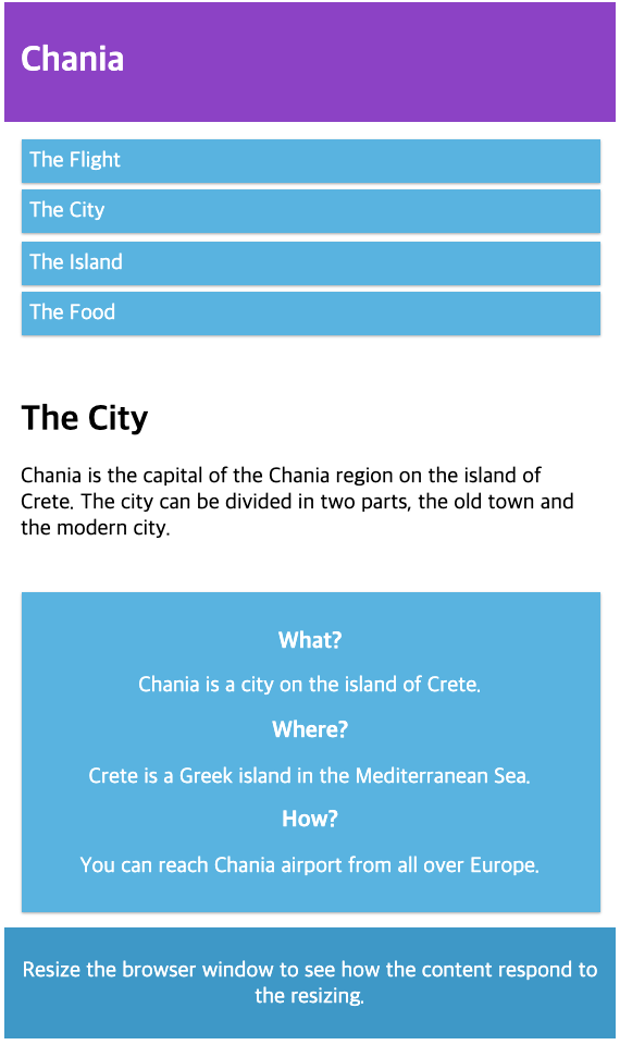
Responsive Web 예시 - 태블릿 화면
위의 사진들을 보면 각 기기마다 웹사이트의 레이아웃이 바뀐 것을 확인할 수 있다. 이렇게 기기별로 각각의 화면을 구성해주는 기술이 Responsive Web이다.
Responsive Web Design 관련 tag 및 css
1. meta viewport
Viewport는 사용자의 디바이스 화면에서 보여지는 영역을 의미한다. 원래 웹 페이지는 데스크탑에서만 동작했지만 스마트폰과 태블릿의 출현으로 작은 화면으로 웹 페이지를 사용하는 데에 불편함이 있었기 때문에 스마트폰과 태블릿에서도 편리하게 웹 페이지를 사용할 수 있도록 하는 responsive web이 등장했다. 그런 관점에서 viewport는 특정 기기에서 웹 페이지를 볼 수 있는 크기, 즉 해당 디바이스의 화면의 크기를 의미한다.
<head>
  <meta name="viewport" content="width=device-width, initial-scale=1.0">
  <style>
    img{
      max-width: 100%;
      height: auto;
    }
  </style>
</head>
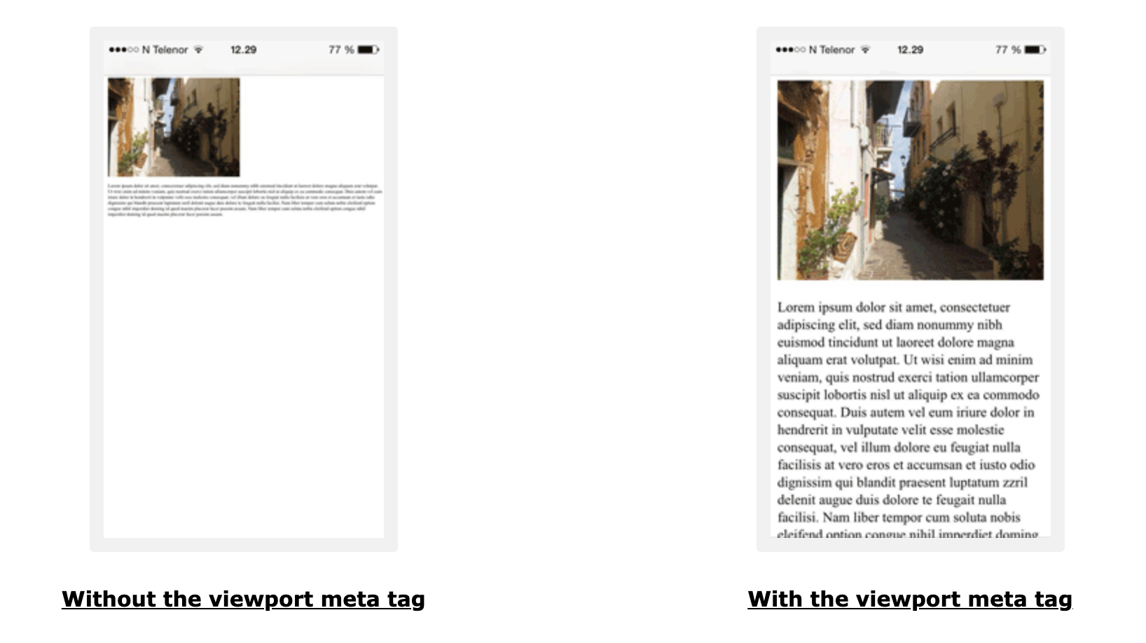
Viewport는 meta 태그 안에서 사용이 되는데 보통 meta 태그는 검색 엔진에게 해당 사이트가 어떤 용도의 사이트인지 알려주는 용도로도 사용이 된다. 여기서 meta 태그는 viewport를 만드는 데에 사용이 된다. 위의 코드의 경우 ‘content’ 속성의 ‘width=device-width’ 라는 것은 넓이를 화면의 넓이로 맞춘다는 뜻이고 ‘initial-scale=1.0’은 브라우저가 처음에 페이지를 로딩했을 때 페이지의 비율이 100%라는 뜻이다. 즉, 위의 코드는 어떤 기기든 100% 크기로 화면에 딱 맞게 보여주라는 코드이다.
Meta tag 적용 전과 적용 후
2. Grid-View
1. Grid-View
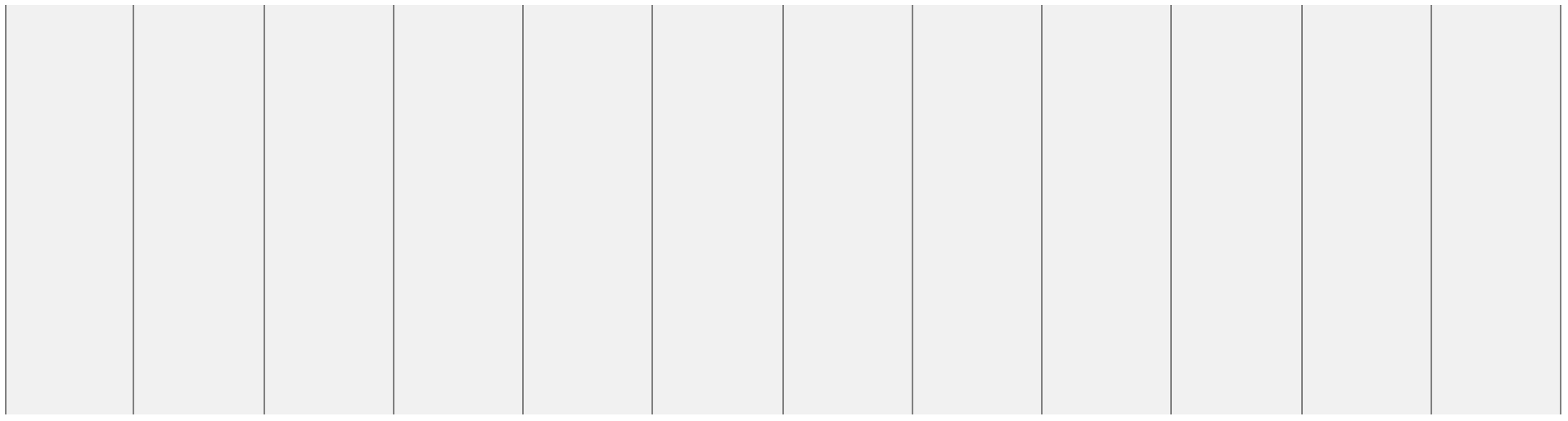
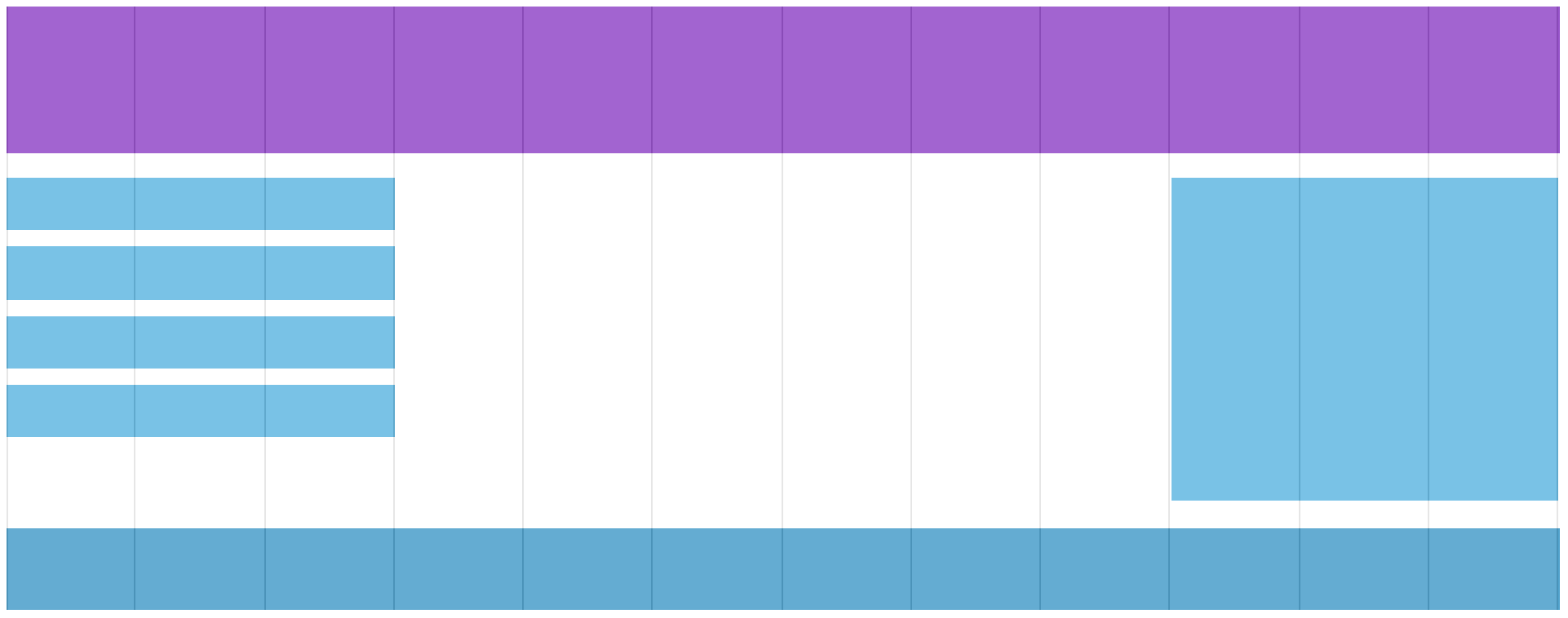
Grid-view는 웹페이지를 디자인할 때 페이지의 각 요소들을 배치하기 위해 활용하는 세로로 된 가상의 구분선이다. 많은 웹페이지들은 이런 grid-view를 기반으로 만들어져있다. 보통 grid-view는 12개의 column으로 구성되어 있는데 이러한 구성이 웹페이지를 디자인할 때 큰 도움이 된다.
Grid-view 예시 1
Grid-view 예시 2
2. Box-sizing 속성
Grid-view를 사용하기 위해서는 CSS에 ‘box-sizing: border-box;’ 라는 속성을 추가해줘야 하는데 이 속성은 해당 영역 내에 margin이나 padding을 적용하더라도 해당 영역을 벗어나지 않게 해주는 속성이다.
<!DOCTYPE html>
<html>
<head>
<style>
.div1 {
  width: 300px;
  height: 100px;
  border: 1px solid blue;
}

.div2 {
  width: 300px;
  height: 100px;
  padding: 50px;
  border: 1px solid red;
}
</style>
</head>
<body>

<div class="div1">This div is smaller (width is 300px and height is 100px).</div>
<br>
<div class="div2">This div is bigger (width is also 300px and height is 100px).</div>

</body>
</html>
결과
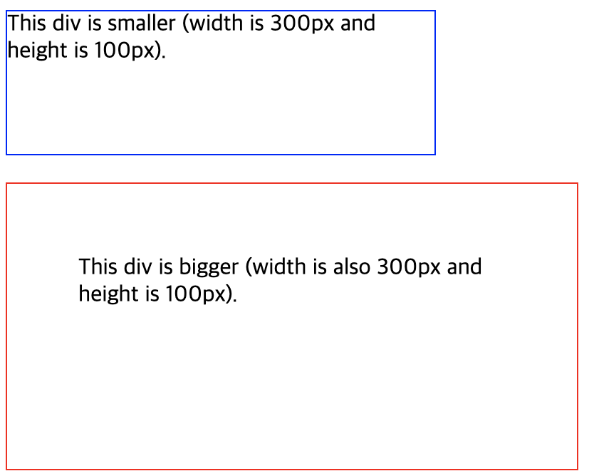
위의 코드와 결과는 Box-sizing 속성이 적용이 안됐을 때 발생하는 문제점을 보여준다. 똑같이 div 태그로 감쌌지만 div2 클래스의 경우 패딩을 주자 크기가 지정되어 있는 width인 300px을 넘어가 버렸다. 아래는 ‘box-sizing: border-box’ 속성을 적용한 코드이다.
<!DOCTYPE html>
<html>
<head>
<style>
.div1 {
  width: 300px;
  height: 100px;
  border: 1px solid blue;
  box-sizing: border-box;
}

.div2 {
  width: 300px;
  height: 100px;
  padding: 50px;
  border: 1px solid red;
  box-sizing: border-box;  /* box-sizing 속성 적용 */
}
</style>
</head>
<body>

<div class="div1">Both divs are the same size now!</div>
<br>
<div class="div2">Hooray!</div>

</body>
</html>
결과
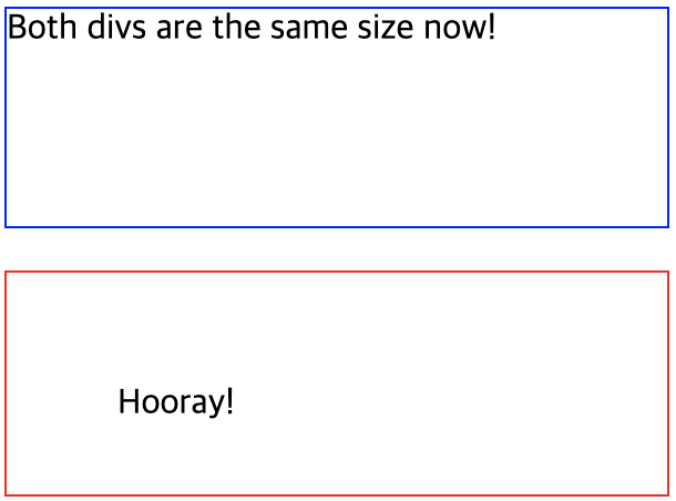
똑같은 코드에 ‘box-sizing: border-box’ 속성을 한줄만 적용했는데 패딩이 주어져도 지정돼있는 width인 300px을 넘어가지 않았다. 웹페이지의 요소들을 배치하기 위해 box-sizing 속성이 필요한 이유이다.
3. Relative Positioning
보통 웹페이지에서 각 요소들을 배치할 때 해당 요소들의 크기를 pixel 사이즈로 절대적으로 지정하기 보다는 비율로 상대적으로 지정한다. 각 디바이스 별로 화면의 높이와 넓이가 각양각색이기 때문이다. 아래는 요소들의 크기를 비율로 지정한 코드이다.
<!DOCTYPE html>
<html>
<head>
<meta name="viewport" content="width=device-width, initial-scale=1.0">
<style>
* {
  box-sizing: border-box;
}

.header {
  border: 1px solid red;
  padding: 15px;
}

.row::after {
  content: "";
  clear: both;
  display: table;
}

[class*="col-"] {
  float: left;
  padding: 15px;
  border: 1px solid red;
  /* 모든 요소에 공통적으로 위의 속성을 적용한다 */
}

.col-1 {width: 8.33%;}
.col-2 {width: 16.66%;}
.col-3 {width: 25%;}
.col-4 {width: 33.33%;}
.col-5 {width: 41.66%;}
.col-6 {width: 50%;}
.col-7 {width: 58.33%;}
.col-8 {width: 66.66%;}
.col-9 {width: 75%;}
.col-10 {width: 83.33%;}
.col-11 {width: 91.66%;}
.col-12 {width: 100%;}
  /* 화면을 12개로 나눠서 비율로 크기를 지정한다(화면을 차지하는 비율) */

</style>
</head>
<body>

<div class="header">
  <h1>Chania</h1>
</div>

<div class="row">

<div class="col-3">  <!-- col-3 클래스의 경우 위에서 25%의 넓이를 가지고 있기 때문에 화면에서 25%의 넓이로 지정된다 -->
  <ul>
    <li>The Flight</li>
    <li>The City</li>
    <li>The Island</li>
    <li>The Food</li>
  </ul>
</div>

<div class="col-9"> <!-- col-9 클래스의 경우 위에서 75%의 넓이를 가지고 있기 때문에 화면에서 75%의 넓이로 지정된다 -->
  <h1>The City</h1>
  <p>Chania is the capital of the Chania region on the island of Crete. The city can be divided in two parts, the old town and the modern city.</p>
  <p>Resize the browser window to see how the content respond to the resizing.</p>
</div>

</div>

</body>
</html>
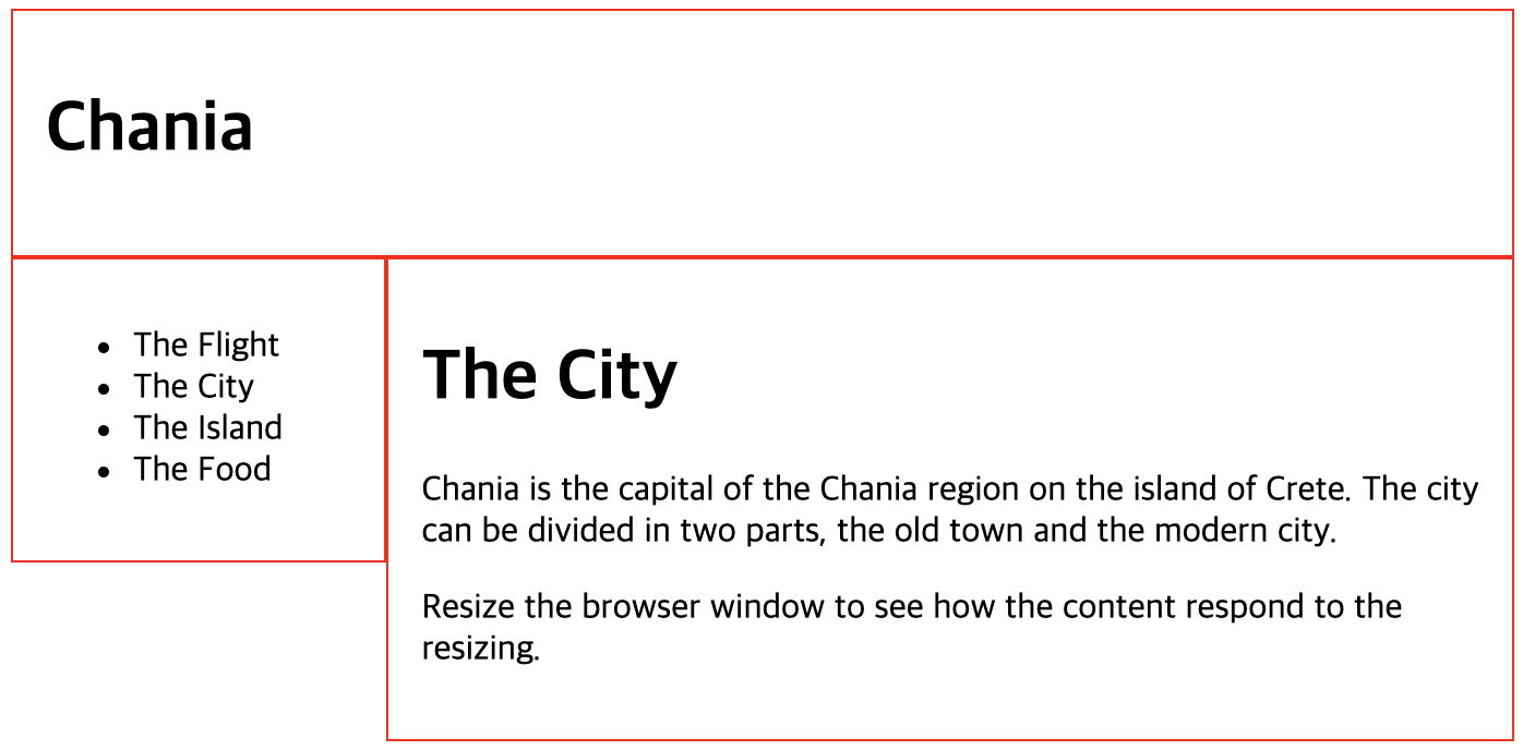
결과
3. Media Queries
Media query는 CSS3에 처음 소개된 기술로 특정 조건이 참일 때 ‘@media’ rule을 사용하여 스타일을 정의하는 방식이다. CSS에서 ‘@’로 시작하는 문법은 특정 조건에서만 실행되는 스타일을 지정할 때 쓰이는 데 Media queries의 경우 @media로 시작하게 된다.
<!DOCTYPE html>
<html>
<head>
<meta name="viewport" content="width=device-width, initial-scale=1.0">
<style>
body {
background-color: lightgreen; /* default 배경색은 연두색이다 */
}
@media only screen and (max-width: 600px) {
body {
background-color: lightblue; /* 하지만 화면 크기가 max-width: 600px의 경우, 즉 600px이하의 화면 크기의 경우 배경색은 하늘색이다 */
}
}
</style>
</head>
<body>
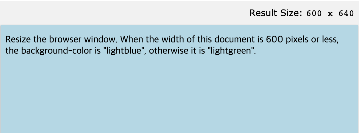
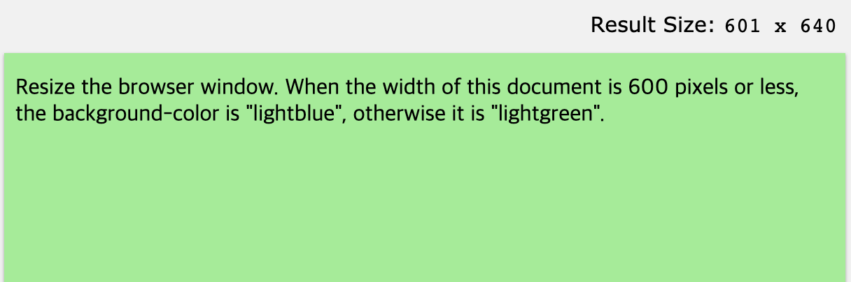
<p>Resize the browser window. When the width of this document is 600 pixels or less, the background-color is "lightblue", otherwise it is "lightgreen".</p>
</body>
</html>
결과
Media Queries 의 활용
-
max-width, max-height: 디바이스 화면(브라우저)의 너비, 높이의 최대치
-
min-width, min-height: 디바이스 화면(브라우저)의 너비, 높이의 최소치
-
max-color, max-color-index: 디바이스의 표현 가능한 최대 컬러 비트 수, 최대 컬러 갯수
-
orientation: 화면(viewport) 표시 방향(landscape or portrait)
-
max-aspect-ratio, min-aspect-ratio: 화면의 가로:세로 비율 최대치, 최소치
-
resolution: 출력 디바이스의 해상도(dpi, dpcm)
Media Queries 활용 예시 - 두가지 조건
<!DOCTYPE html>
<html>
<head>
  <meta name="viewport" content="width=device-width, initial-scale=1.0">
  <style>
    @media only screen and (min-width: 480px) and (max-width: 768px) {
      body {
        /* css code */
      }
    } /* 디바이스 화면(브라우저)의 너비가 480이상, 768이하 일 때 css 코드 실행 */
  </style>
종합 코드
<!DOCTYPE html>
<html>
<head>
<meta name="viewport" content="width=device-width, initial-scale=1.0">
<style>
* {
  box-sizing: border-box;  /* box-sizing 속성 적용 */
}

video {
  width: 100%;    /* video가 들어있는 영역 안에서 꽉 채워라 */
  height: auto;   /* 넓이에 비례해서 원래 비율로 높이를 맞춰라 */
}

.row:after {
  content: "";
  clear: both;
  display: table;
}

[class*="col-"] {  /* 모든 'col-'로 시작하는 클래스들에 적용할 css 속성 */
  float: left;
  padding: 15px;
  width: 100%;
}

@media only screen and (min-width: 600px) { /* 600px이상, 768px미만의 넓이를 가질 때(태블릿 모드) */
  .col-s-1 {width: 8.33%;}
  .col-s-2 {width: 16.66%;}
  .col-s-3 {width: 25%;}
  .col-s-4 {width: 33.33%;}
  .col-s-5 {width: 41.66%;}
  .col-s-6 {width: 50%;}
  .col-s-7 {width: 58.33%;}
  .col-s-8 {width: 66.66%;}
  .col-s-9 {width: 75%;}
  .col-s-10 {width: 83.33%;}
  .col-s-11 {width: 91.66%;}
  .col-s-12 {width: 100%;}
}

@media only screen and (min-width: 768px) { /* 768px이상의 넓이를 가질 때(데스크탑 모드) */
  .col-1 {width: 8.33%;}
  .col-2 {width: 16.66%;}
  .col-3 {width: 25%;}
  .col-4 {width: 33.33%;}
  .col-5 {width: 41.66%;}
  .col-6 {width: 50%;}
  .col-7 {width: 58.33%;}
  .col-8 {width: 66.66%;}
  .col-9 {width: 75%;}
  .col-10 {width: 83.33%;}
  .col-11 {width: 91.66%;}
  .col-12 {width: 100%;}
}

html {
  font-family: "Lucida Sans", sans-serif;  /* 모든 html에 적용될 폰트 */
}

.header {
  background-color: #9933cc;
  color: #ffffff;
  padding: 15px;
}

.menu ul {
  list-style-type: none;
  margin: 0;
  padding: 0;
}

.menu li {
  padding: 8px;
  margin-bottom: 7px;
  background-color: #33b5e5;
  color: #ffffff;
  box-shadow: 0 1px 3px rgba(0,0,0,0.12), 0 1px 2px rgba(0,0,0,0.24);
}

.menu li:hover {
  background-color: #0099cc;
}

.aside {
  background-color: #33b5e5;
  padding: 15px;
  color: #ffffff;
  text-align: center;
  font-size: 14px;
  box-shadow: 0 1px 3px rgba(0,0,0,0.12), 0 1px 2px rgba(0,0,0,0.24);
}

.footer {
  background-color: #0099cc;
  color: #ffffff;
  text-align: center;
  font-size: 12px;
  padding: 15px;
}
</style>
</head>
<body>

<div class="header"> <!-- 이 영역에 대해서는 media queries 가 적용되지 않음. 화면 크기에 관계없이 동일하게 표시됨 -->
  <h1>Chania</h1>
</div>

<div class="row">
  <div class="col-3 col-s-3 menu"> <!-- 데스크탑 모드, 태블릿 모드 일때 50%의 넓이 적용 -->
    <ul>
      <li>The Flight</li>
      <li>The City</li>
      <li>The Island</li>
      <li>The Food</li>
    </ul>
  </div>

  <div class="col-6 col-s-9"> <!-- 데스크탑 모드일 때는 50%의 넓이, 태블릿 모드일 때는 75%의 넓이 적용 -->
    <h1>The City</h1>
    <p>Chania is the capital of the Chania region on the island of Crete. The city can be divided in two parts, the old town and the modern city.</p>
    <video width="400" controls>
      <source src="mov_bbb.mp4" type="video/mp4">
      <source src="mov_bbb.ogg" type="video/ogg">
      Your browser does not support HTML5 video.
    </video>
  </div>

  <div class="col-3 col-s-12"> <!-- 데스크탑 모드일 때는 25%의 넓이, 태블릿 모드일 때는 100%의 넓이 적용 -->
    <div class="aside">
      <h2>What?</h2>
      <p>Chania is a city on the island of Crete.</p>
      <h2>Where?</h2>
      <p>Crete is a Greek island in the Mediterranean Sea.</p>
      <h2>How?</h2>
      <p>You can reach Chania airport from all over Europe.</p>
    </div>
  </div>
</div>

<div class="footer"> <!-- 이 영역에 대해서는 media queries 가 적용되지 않음. 화면 크기에 관계없이 동일하게 표시됨 -->
  <p>Resize the browser window to see how the content respond to the resizing.</p>
</div>

</body>
</html>
결과
데스크탑 모드
태블릿 모드
스마트폰 모드
Leave a comment